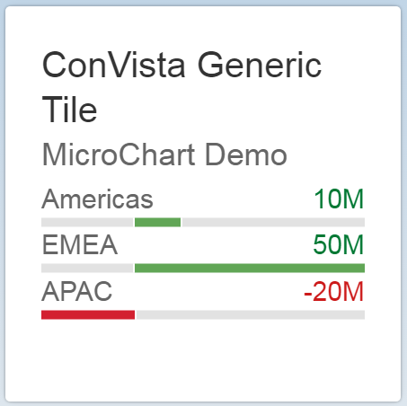
Generic Fiori Tile
View on GitHub Download .zip Download .tar.gzClone links for SAP WebIDE
https://github.com/MartinPankraz/ConVista-Generic-Tile.git https://github.com/MartinPankraz/ConVista-Generic-Tile-two-by-one.git
Clone links for SAP WebIDE
https://github.com/MartinPankraz/ConVista-Generic-Tile.git https://github.com/MartinPankraz/ConVista-Generic-Tile-two-by-one.gitGeneric Fiori Tile by ConVista Consulting to enhance Fiori Launchpad Experience.
According to the SAP Fiori community you can achieve a similar solution as of HANA SP09 with the Custom App Launcher tile type. However my solution does not involve programming object deployment or a HANA platform at all. So if you want to keep it simple, read on...
Generally speaking my custom tile extends the standard Fiori Dynamic Tile exposing its content to the tile configuration screen. Thanks to jsonp you can assign any service on the web as source for your content.
You can add any UI5 content that fits the tile's space. Just browse SAPUI5 explored and check the underlying XML-View code. Wrap that XML-snippet in a UI5 fragment-tag defining the necessary namespaces (e.g xmlns="sap.suite.ui.microchart") and you are good to go.
The service callback is added to a JSONModel so that you can use UI5 templates to feed the values into your custom tile dynamically during runtime. All examples used on the website use the yahoo finance API but you are not limited to that.
As per Fiori style guide your tiles can be rendered in two shapes. The standard tile is a square (1x1). The second option is a wide rectangle (2x1). They adapt slightly on mobile devices in total size to save space.
NetWeaver Gateway with active Fiori Launchpad
UI5 library version 1.38.5 +
The Yahoo Query Language (YQL) - is a sql-like language to query Yahoo's Web Services and API's such as the Yahoo Finance API. I am using the Finance API in all of my examples given below. You can find more information on YQL, available API's and usage examples here: YQL.
There is also a developer console to create your API queries in a simplified environment. It makes sense to have the query right, before integrating it with my custom Fiori tile. Please note that you need to work with JSON output rather than XML because my component relies on JSON models.
The following properties are intended to be used with the Fiori "OneByOne" tile configuration screen.

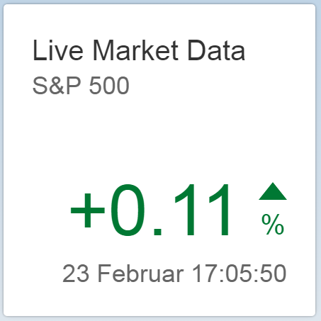
Value loaded from iextrading Finance API in json format.
Check first example picture "DAX live feed with trend indicator" above for reference.
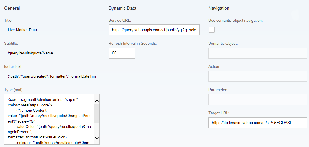
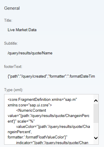
Live Market Data
JSONModel path for API callback structure
/symbol<core:FragmentDefinition xmlns="sap.m" xmlns:core="sap.ui.core">
<NumericContent
value = "{
path:'/changePercent'
}"
scale = "%"
valueColor = "{
path:'/changePercent',
formatter:'.formatFloatValueColor'
}"
indicator = "{
path:'/changePercent',
formatter:'.formatFloatValueIndicator'
}"
truncateValueTo = "5"
/>
</core:FragmentDefinition>
Complex template for text property of footer. It uses the JSONModel path for the created date of API callback and the date formatter function.
{"path":"/latestUpdate","formatter":".formatDateTime"}
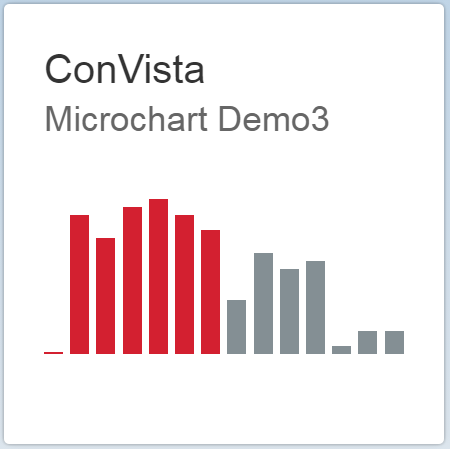
Check last example picture from image gallery "Market Data Trend Chart" above for reference.
The following properties are intended to be used with the Fiori tile configuration screen.
Please note that the custom parameter moveYahooDates=true takes care of moving the initial dates of the API call forward maintaining the same spread. Check method getMovingDateInterval on the Tile controller for details.
DAX - Market Trend
JSONModel path for Yahoo API callback structure. The structure contains a string but I am applying a number format
/19/close
<core:FragmentDefinition xmlns="sap.suite.ui.microchart" xmlns:core="sap.ui.core">
	<AreaMicroChart width="144px" height="62px">
	    <firstYLabel>
	        <AreaMicroChartLabel
	            label = "{
	                path:'/0/close',
	                formatter:'.formatValueShortNumber'
	            }"
	            color = "Neutral"/>
	    </firstYLabel>
	    <lastYLabel>
	        <AreaMicroChartLabel
	            label = "{
	                path:'/19/close',
	                formatter:'.formatValueShortNumber'
	            }"
	            color = "Neutral"/>
	    </lastYLabel>
	    <firstXLabel>
	        <AreaMicroChartLabel
	            label = "{
	                path:'/0/date',
	                formatter:'.formatDateShort'
	            }"
	            color = "Neutral"/>
	    </firstXLabel>
	    <lastXLabel>
	        <AreaMicroChartLabel
	            label = "{
	                path:'/19/date',
	                formatter:'.formatDateShort'
	            }"
	            color = "Neutral"/>
	    </lastXLabel>
	    <chart>
	        <AreaMicroChartItem
	            points = "{
	                path:'/'
	            }">
	            <points>
	                <AreaMicroChartPoint
	                    x = "{
	                        path:'close',
	                        formatter:'.formatValueToCounter'
	                    }"
	                    y = "{
	                        path:'close'
	                    }" />
	            </points>
	        </AreaMicroChartItem>
	    </chart>
	</AreaMicroChart>
</core:FragmentDefinition>
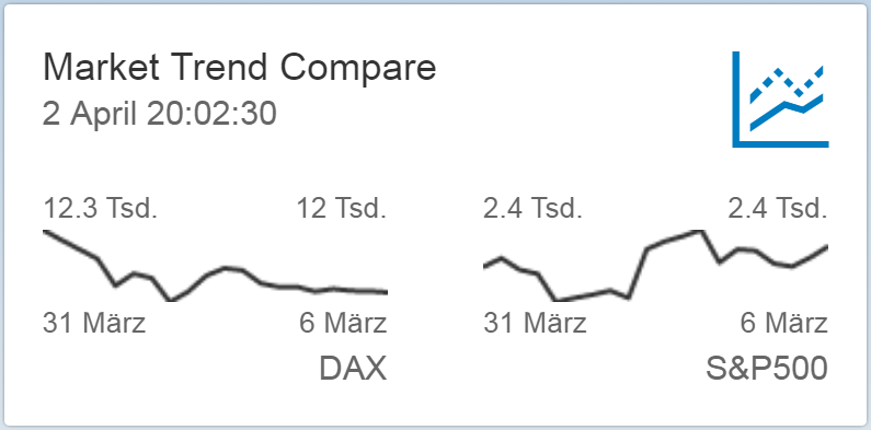
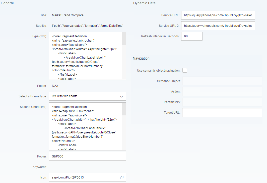
Two by One Tile example with two columns showing live data from iextrading finance API. That way you could compare trends for example.
You can switch in between two display modes. Either you have one wide object (e.g. a chart) or you have two smaller objects next to each other. For the latter option you get an additional Service URL input as well as individual footer texts. If you don't fill the second service URL, the first one will be used for the second object and footer as well.
In order to avoid SAPUI5 model problems I introduced a named model for the second object. That way model path overlaps are avoided. This means you need to prefix your paths to access the second API URL values with secondAPI. An example could look like this:
{
	path:'secondAPI>/0/close',
	formatter:'.formatValueShortNumber'
}The following properties are intended to be used with the Fiori "TwoByOne" tile configuration screen. This tile can have two xml snippets in order to divide the tile in two parts, but it can also have only one, rendering it in a wide mode. Notice the selection input to choose between 2x1 tile with one or two charts.
Please note that the custom parameter moveYahooDates=true takes care of moving the initial dates of the API call forward maintaining the same spread. Check method getMovingDateInterval on the Tile controller for details.
Market Trend Compare
JSONModel path for API callback structure
{"path":"/19/date","formatter":".formatDateTime"}
<core:FragmentDefinition xmlns="sap.suite.ui.microchart" xmlns:core="sap.ui.core">
	<AreaMicroChart width="144px" height="62px">
	    <firstYLabel>
	        <AreaMicroChartLabel
	            label = "{
	                path:'/0/close',
	                formatter:'.formatValueShortNumber'
	            }"
	            color = "Neutral"/>
	    </firstYLabel>
	    <lastYLabel>
	        <AreaMicroChartLabel
	            label = "{
	                path:'/19/close',
	                formatter:'.formatValueShortNumber'
	            }"
	            color = "Neutral"/>
	    </lastYLabel>
	    <firstXLabel>
	        <AreaMicroChartLabel
	            label = "{
	                path:'/0/date',
	                formatter:'.formatDateShort'
	            }"
	            color = "Neutral"/>
	    </firstXLabel>
	    <lastXLabel>
	        <AreaMicroChartLabel
	            label = "{
	                path:'/19/date',
	                formatter:'.formatDateShort'
	            }"
	            color = "Neutral"/>
	    </lastXLabel>
	    <chart>
	        <AreaMicroChartItem
	            points = "{
	                path:'/'
	            }">
	            <points>
	                <AreaMicroChartPoint
	                    x = "{
	                        path:'close',
	                        formatter:'.formatValueToCounter'
	                    }"
	                    y = "{
	                        path:'close'
	                    }" />
	            </points>
	        </AreaMicroChartItem>
	    </chart>
	</AreaMicroChart>
</core:FragmentDefinition>
<core:FragmentDefinition xmlns="sap.suite.ui.microchart" xmlns:core="sap.ui.core">
	<AreaMicroChart width="144px" height="62px">
	    <firstYLabel>
	        <AreaMicroChartLabel
	            label = "{
	                path:'secondAPI>/0/close',
	                formatter:'.formatValueShortNumber'
	            }"
	            color = "Neutral"/>
	    </firstYLabel>
	    <lastYLabel>
	        <AreaMicroChartLabel
	            label = "{
	                path:'secondAPI>/19/close',
	                formatter:'.formatValueShortNumber'
	            }"
	            color = "Neutral"/>
	    </lastYLabel>
	    <firstXLabel>
	        <AreaMicroChartLabel
	            label = "{
	                path:'secondAPI>/0/date',
	                formatter:'.formatDateShort'
	            }"
	            color = "Neutral"/>
	    </firstXLabel>
	    <lastXLabel>
	        <AreaMicroChartLabel
	            label = "{
	                path:'secondAPI>/19/date',
	                formatter:'.formatDateShort'
	            }"
	            color = "Neutral"/>
	    </lastXLabel>
	    <chart>
	        <AreaMicroChartItem
	            points = "{
	                path:'secondAPI>/'
	            }">
	            <points>
	                <AreaMicroChartPoint
	                    x = "{
	                        path:'secondAPI>close',
	                        formatter:'.formatValueToCounter'
	                    }"
	                    y = "{
	                        path:'secondAPI>close'
	                    }" />
	            </points>
	        </AreaMicroChartItem>
	    </chart>
	</AreaMicroChart>
</core:FragmentDefinition>
In order to be able to derive meaning from arbitrary web service callbacks, I added some formatter functions for ease of use. You can call them on your UI5 templates as usual. See my example below or check the Configuration Examples section above for more complex applications.
| Function Name | Description |
|---|---|
| formatDateTime | Format a value to date (d MMMM HH:mm:ss) with medium style |
| formatDateShort | Format a value to date (d MMMM) with short style |
| formatFloatValueColor | Format a float value to Neutral (value 0), Error (value < 0) and Good (value > 0) |
| formatFloatValueIndicator | Format a float value to None (value 0), Down (value < 0) and Up (value > 0) |
| formatIntValueColor | Format a integer value to Neutral (value 0), Error (value < 0) and Good (value > 0) |
| formatIntValueIndicator | Format a integer value to None (value 0), Down (value < 0) and Up (value > 0) |
| formatStringToFloat | Format a float value to String. This is necessary for some UI5 templates. |
| formatValueToCounter | Helper function to get x-axis values for market data to distribute them equally on the axis. It counts the values for the given values. |
| formatValueShortNumber | Format a value to a short number. This is used to shorten big numbers and add abbreviations like (K,M and G etc.). This was used on the market data trend chart example for instance. |
<AreaMicroChartPoint
  x = "{
    path:'close',
    formatter:'.formatValueToCounter'
  }"
  y = "{
    path:'close',
    formatter:'.formatStringToFloat'
  }"
/>
To style your tiles you should rely on the Fiori Launchpad Theme Designer to make sure to achieve a common look&feel across the whole launchpad. You can access the designer like so: http://[server]:[port]/sap/bc/theming/theme-designer/index.html.
A list of standard theme CSS classes can be found here
For margins and spacing check out this link
You should always rely on the standard theming classes to avoid design clashes. But if you really can't help it, I provided a style sheet for you to add your own classes. There are three examples ccTextWhite, ccTextBold and ccTextBig. These were used to create the "minions" tile example. Please note that the styling you apply on the XML box of the configuration screen won't impact the title or the footer. This affects only the tile content.
1) You have two options to deploy the new tile. The first one involves SAP WebIDE and the second one running a SAP backend program. Please note that the execution from WebIDE does not work due to a missing service on the SAP Cloud Platform for chip development.
Clone this GitHub repositories using links below and deploy on ABAP server (Cloud Connector setup necessary for on-premise system)
1X1: https://github.com/MartinPankraz/ConVista-Generic-Tile.git
2X1: https://github.com/MartinPankraz/ConVista-Generic-Tile-two-by-one.git
Upload folder structure of the app using transaction SE38. Please unzip the files first!
This software product is licensed under the Apache License 2.0.
Feel free to contact me for any advice on usage, installation, and plain trouble shooting or a chat about the awesomeness of the fusion of Design Studio and Fiori if you like. Feedback and improvement suggestions are also very welcome.
This component was inspired by the following SCN blog post create-and-use-custom-tile-type